ThoughtSpot is an AI-powered analytics platform that allows users to search and analyze data using natural language, making it accessible to anyone in a business, not just data analysts. I worked remotely with their Bangalore hub, to design concepts as a lead designer for self-service data analytics tools for business users and analysts.
Role: Lead product designer
Platform: Web
Duration: 2020-21
Role: Lead product designer
Platform: Web
Duration: 2020-21
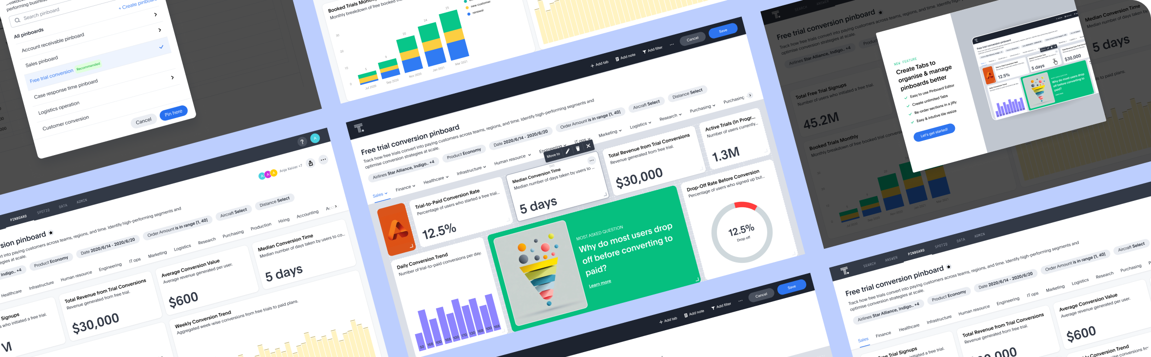
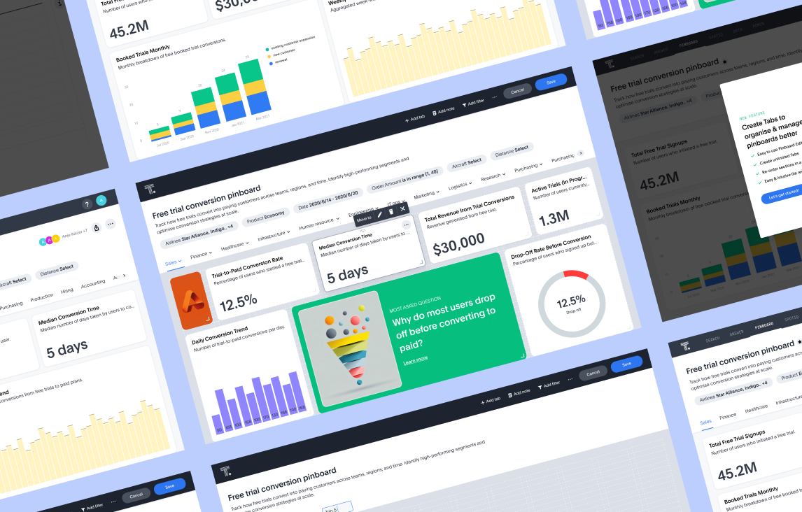
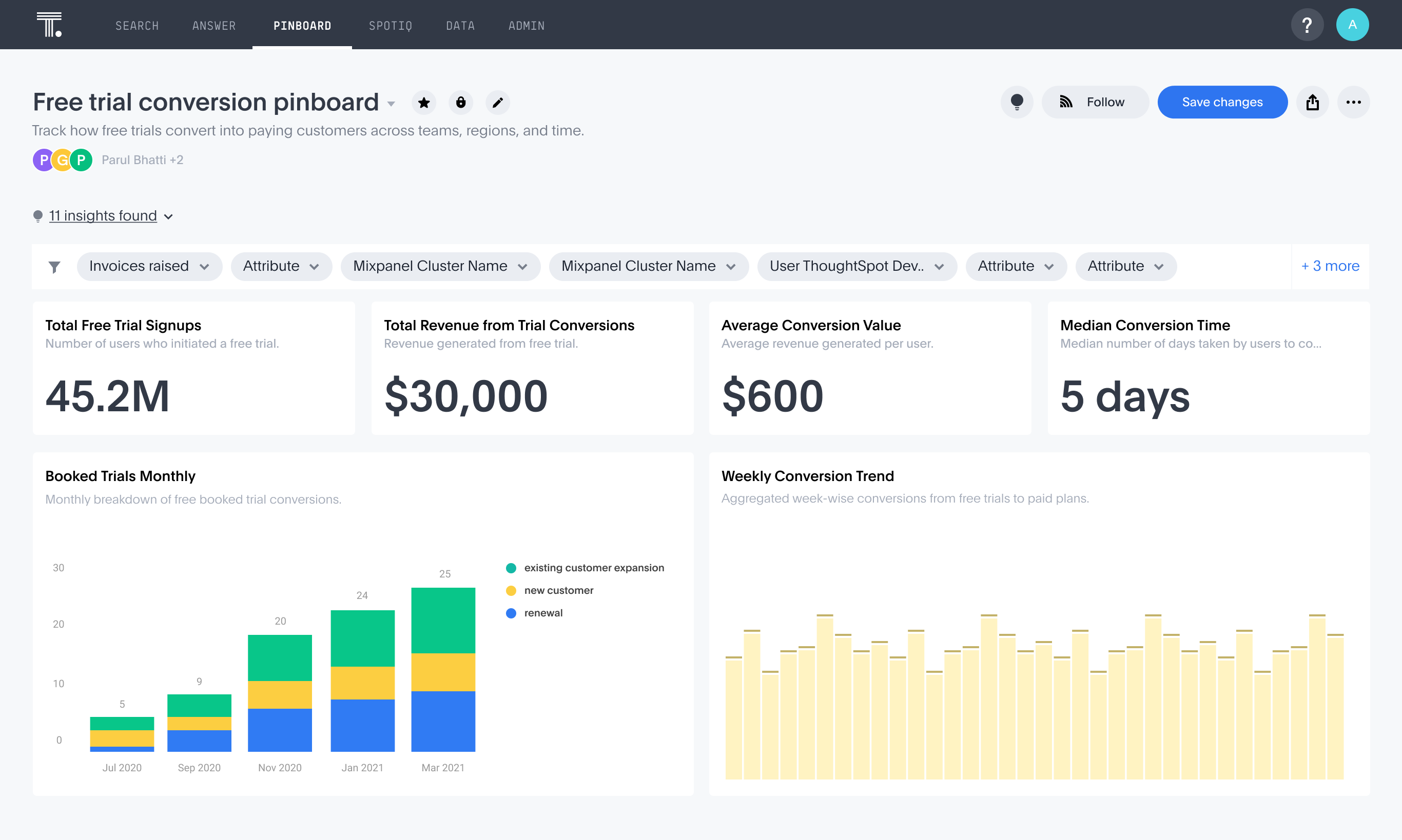
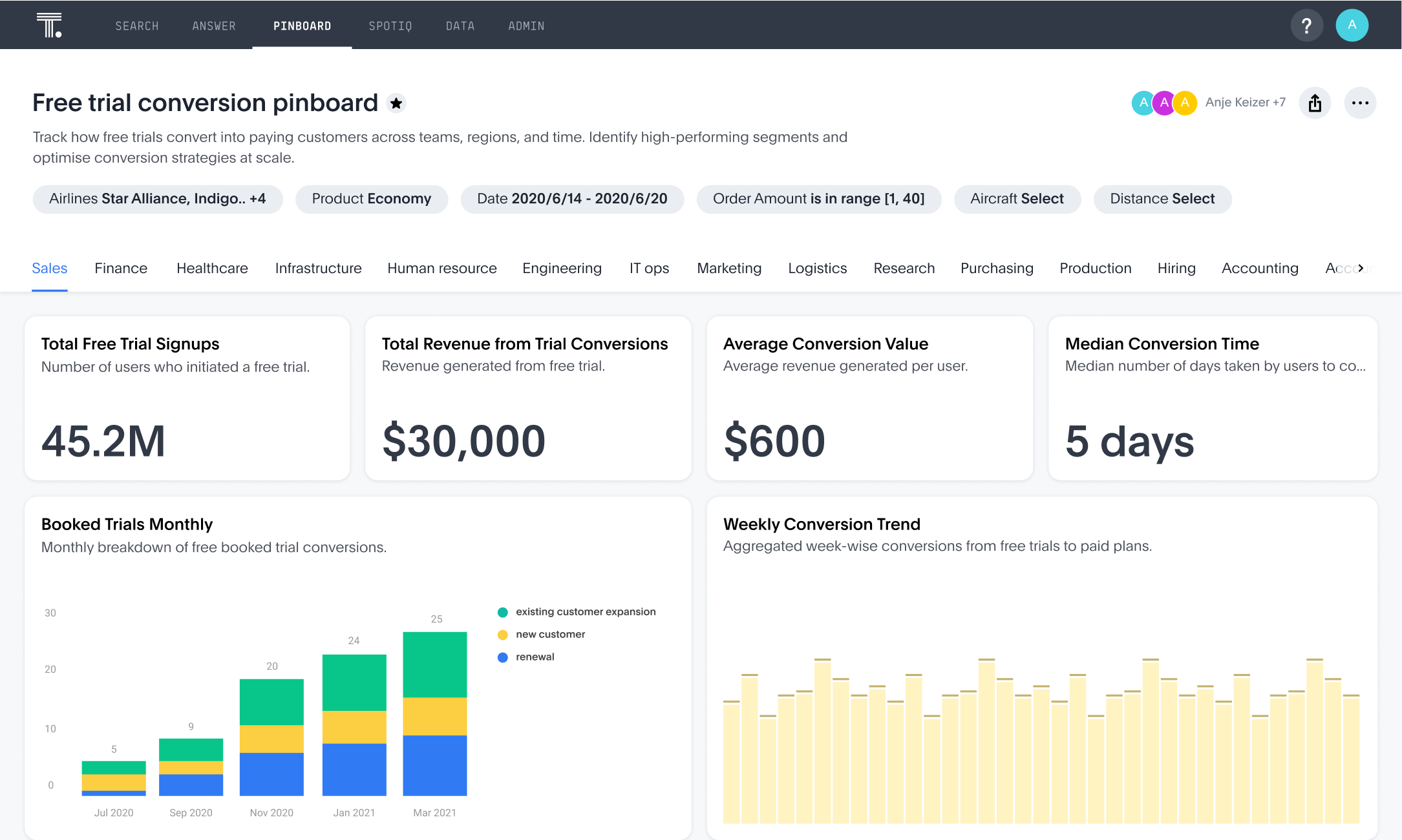
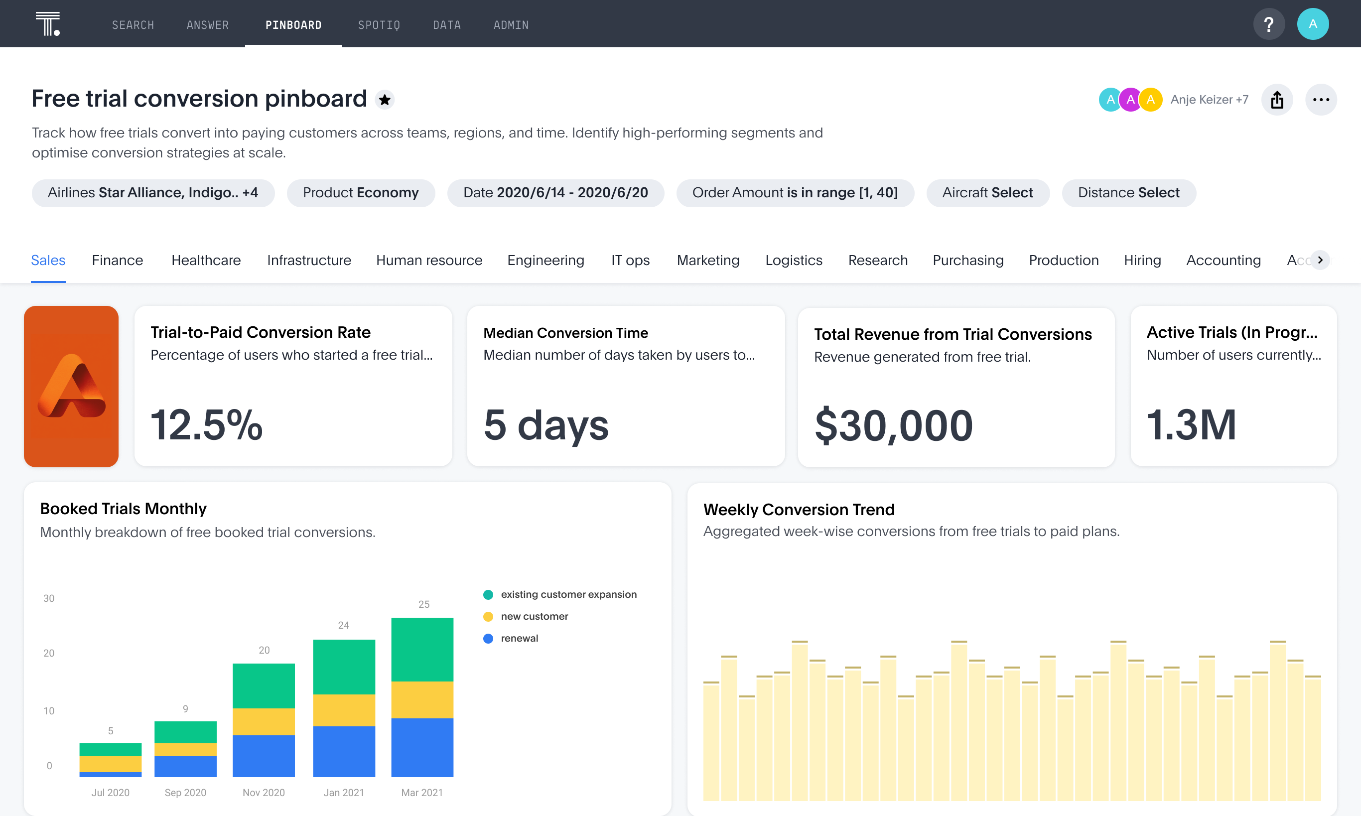
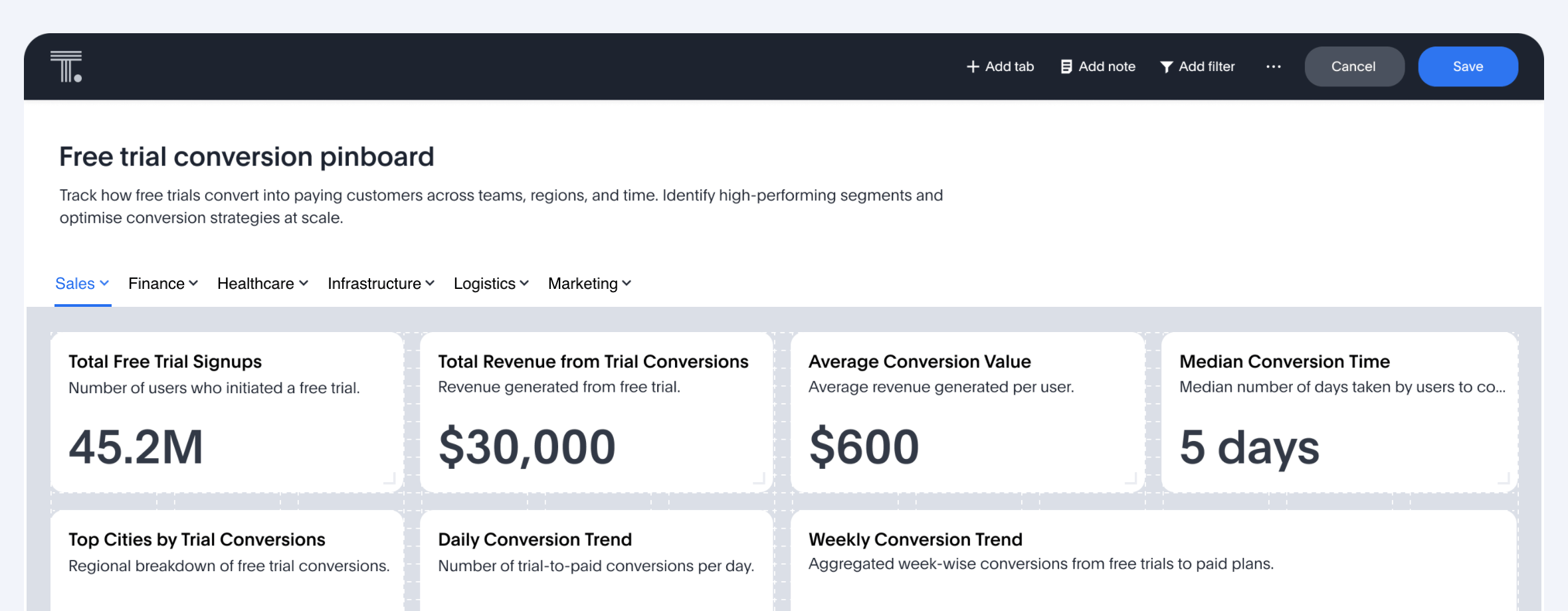
A Pinboard in the ThoughtSpot product is a visual dashboard where users, primarily analysts and business teams, can save, organize, and consume charts derived from underlying datasets. It served as a critical artifact for sharing insights, enabling stakeholders to quickly review filtered visualizations.
Why redesign?
• Rapid adoption overloaded Pinboards built on a limited 4-column layout, slowing navigation and insight discovery.
• No structure for organizing charts made scale and reuse difficult.
• Long scrolls created friction for both consumption and collaboration.
• Needed a modular, role-aware foundation for enterprise-ready dashboards.
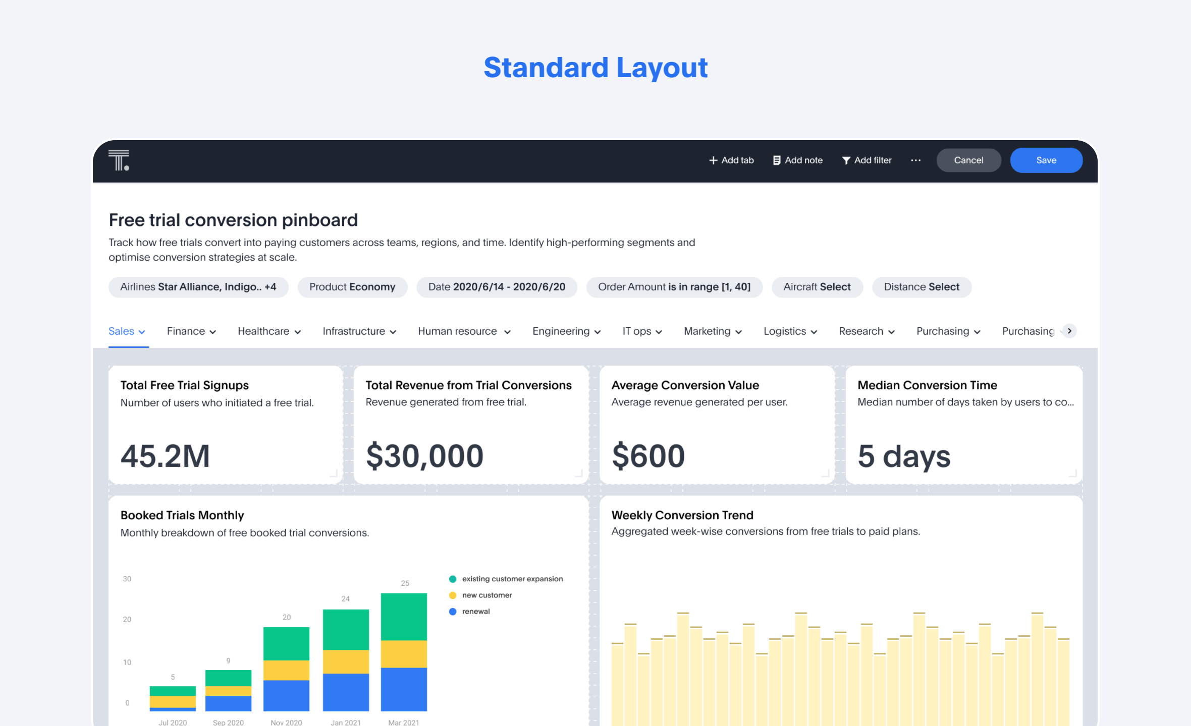
Key foundation of redesign
• 12-Column Grid: Flexible, high-density layouts for scalable storytelling.
• Modes: Clear split between View (consumption) and Edit (creation) to reduce friction.
• Tabs: Structured navigation for large, complex dashboards.
• Smarter Pinning: Encouraged thoughtful curation to reduce clutter and duplication.
To better support both business users and analysts, we introduced MODES: View for consumption and Edit for creation. This shift resolved long-standing UX friction where all actions were previously bundled into a single, undifferentiated interface.
Why MODES?
• Aligned actions to user intent: business consumption vs analyst authoring.
• Prevented accidental edits and confusion in shared dashboards.
• Created a scalable foundation for future editing and customisation tools.
• Enabled clearer permission and role-based access models.
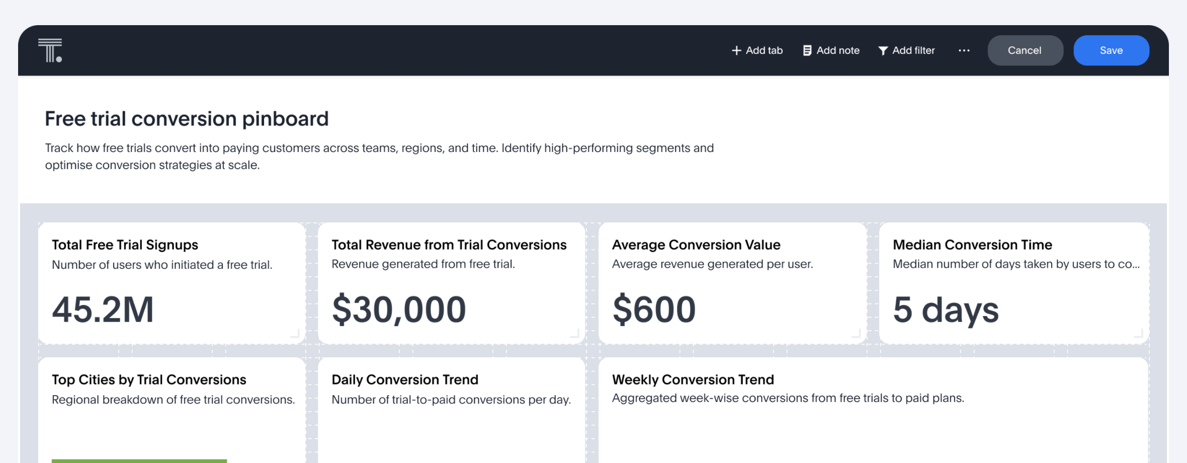
View Mode (Consumption)
Tailored for business users, View Mode is a clean, protected environment for consuming insights. All features here are geared toward browsing, sharing, filtering, and understanding data without the risk of accidental edits.
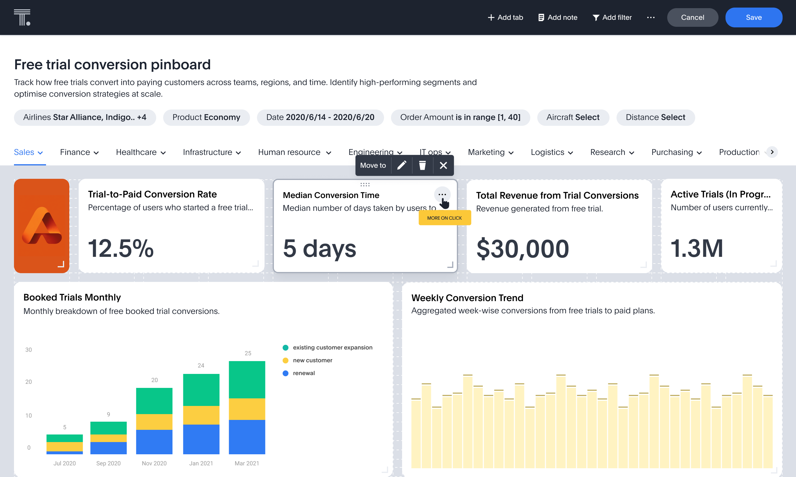
Edit Mode (Creation)
Designed for analysts and power users, Edit Mode enables chart manipulation, tile resizing, section editing, note tiles editing and more. It exposes advanced controls for refining how data is displayed and organized for broader consumption.
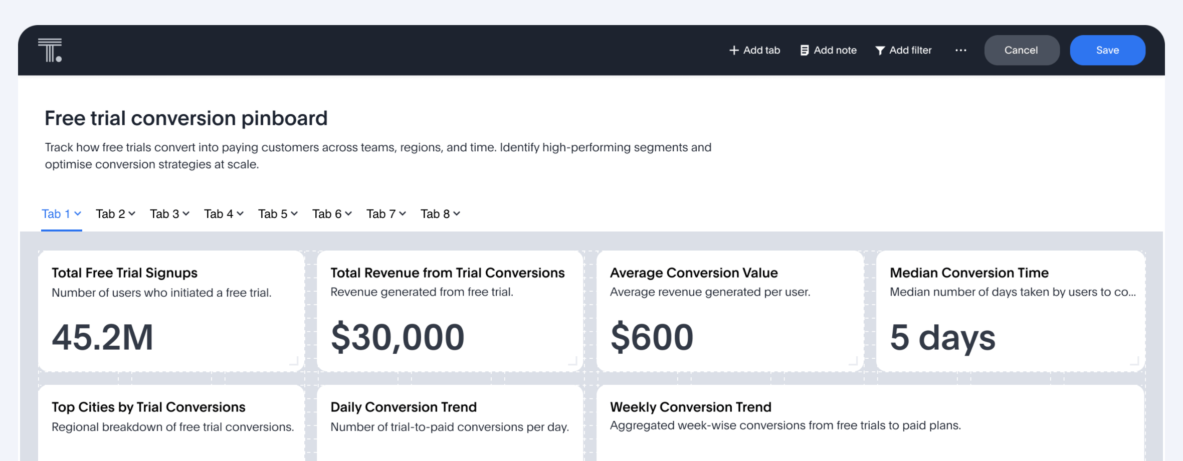
With growing chart density, users needed a way to group related content within a Pinboard. Just as sections help structure long reports, Tabs act as navigable buckets inside a dashboard. These were especially beneficial for enterprise customers with complex reporting needs.
Why TABS?
• Organise large dashboards into thematic sections (e.g., Sales, Marketing, Operations).
• Improve navigation and reduce scroll.
• Enable modular thinking in dashboard design.
• Increase visual clarity and cognitive ease.
Previously limited to fixed sizes, charts on Pinboards lacked layout flexibility. The redesign introduces tile resizing, allowing authors to define focus, hierarchy, and content types more effectively.
Why Resizing matters?
• Better space utilization with a 12-column grid.
• Allows Analysts to define visual priority of charts.
• More charts per screen, less vertical scroll.
• Supports rich media tiles like logos, images, and external links for enhanced storytelling.
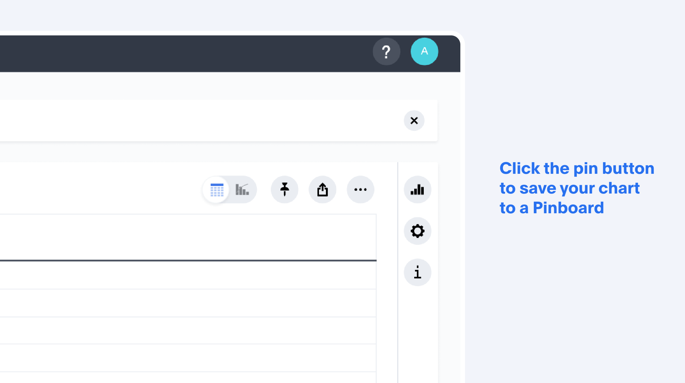
The earlier ‘Pin to Pinboard’ flow was a low-intent, one-way interaction. Users had limited clarity on where a chart would land, often resulting in cluttered dashboards and fragmented insights. To address this, we redesigned the flow as a more intentional, guided curation process.
Phase 1 Logic
Implement a rule-based recommendation system:
• Prioritise recently used Pinboards.
• Match chart titles/keywords with Pinboard names or tab labels.
• Tag the top result as Recommended.
Phase 2 Logic
Introduce ML-backed scoring using user pinning history, content similarity, and usage patterns to deliver more personalized and accurate Pinboard suggestions over time.
Project Status
Partially launched in 2022
Key Metrics
1. Adoption & Usage
• % Increase in Pinboard creations (after redesign rollout).
• % of users using Edit Mode vs View Mode (segmented by persona: analyst vs business user).
• % of Pinboards with multiple Tabs (indicates organisation behaviour).
2. Engagement & Retention
• % Increase in filter usage (showing interaction depth).
• % of Pinboards with multiple Tabs (indicates organisation behaviour).
3. Qualitative Feedback
• % No. of support tickets related to Pinboard layout or chart management (should drop).
• % Analyst vs Business User NPS (Net Promoter Score) for dash boarding.