Numberz is a fintech startup helping businesses manage cash flow and account receivables. I joined as one of the first designers and led the end-to-end design of their iOS cashflow management app. Post launch, I collaborated with the founders on product ideas around GST filing and payment collections for CAs. I also built a multidisciplinary design team comprising a UX intern, a researcher designer, and a UX engineer, and together we launched the Account Receivables web app in early 2018.
Role: Head of Design / Founding Designer
Platform: Web & Mobile (iOS)
Duration: 2017-18
Role: Head of Design / Founding Designer
Platform: Web & Mobile (iOS)
Duration: 2017-18
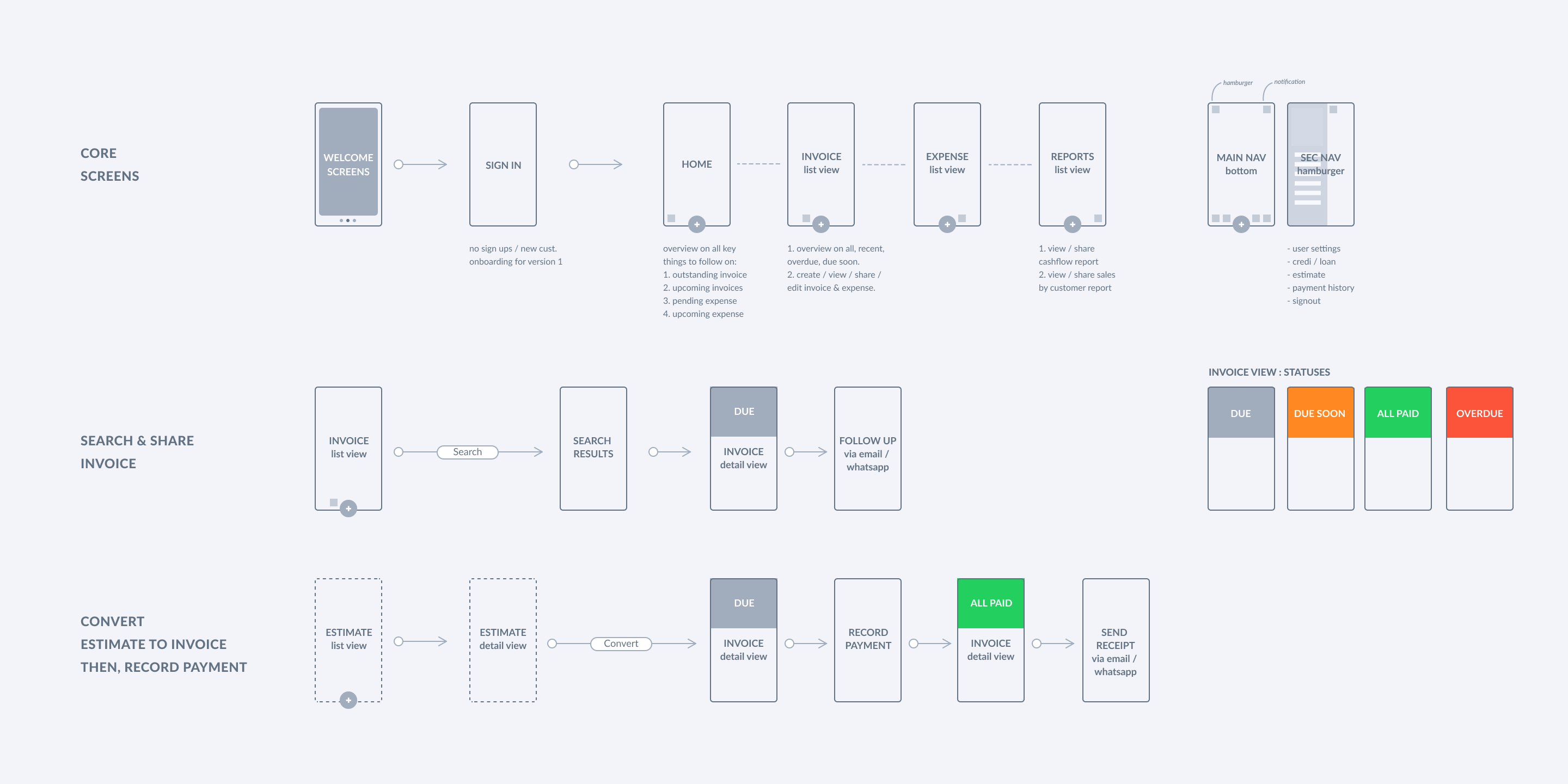
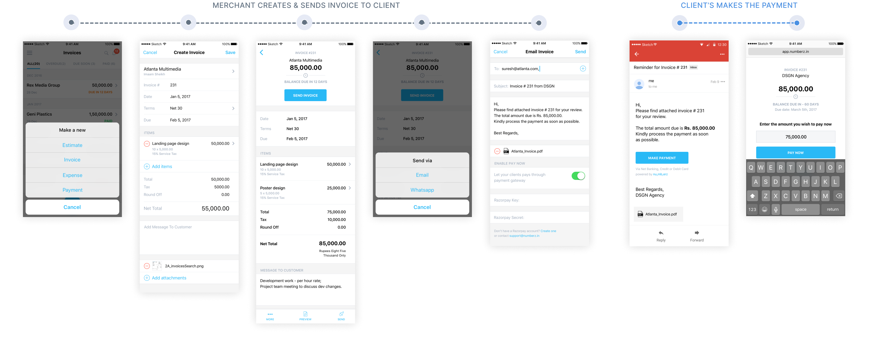
The brief was to design a simple invoicing & expense management ios app that helps numberz’s existing web app customers manage their business anytime & anywhere on mobile. We followed ios first approach since the existing user base was mostly iphone users.
I studied the existing web app and sifted through customer complaints to identify the problem areas in the workflows. I got founder's alignment on 'not replicating the web experience on app' since the user expectation and interactions on mobile are different. Thinking mobile forced us to think about what’s really important for customers. As a result, we designed & released the core functionalities first, i.e. letting customer create, send and track invoices & expenses and view critical reports with ease on mobile.
Target customers
The target customers were numberz’s existing cashflow management web app users, consisting of freelancers and small businesses owners.
PRODUCT IDEATION SNIPPETS
Help user make most of
the data in a glance
Design for speed &
simplicity
Keep the mobile UI
bespoke yet modular
Deliver information in an
easier, more consumable way
Help user make most of
the data in a glance
Design for speed &
simplicity
Keep the mobile UI
bespoke yet modular
Deliver information in an
easier, more consumable way
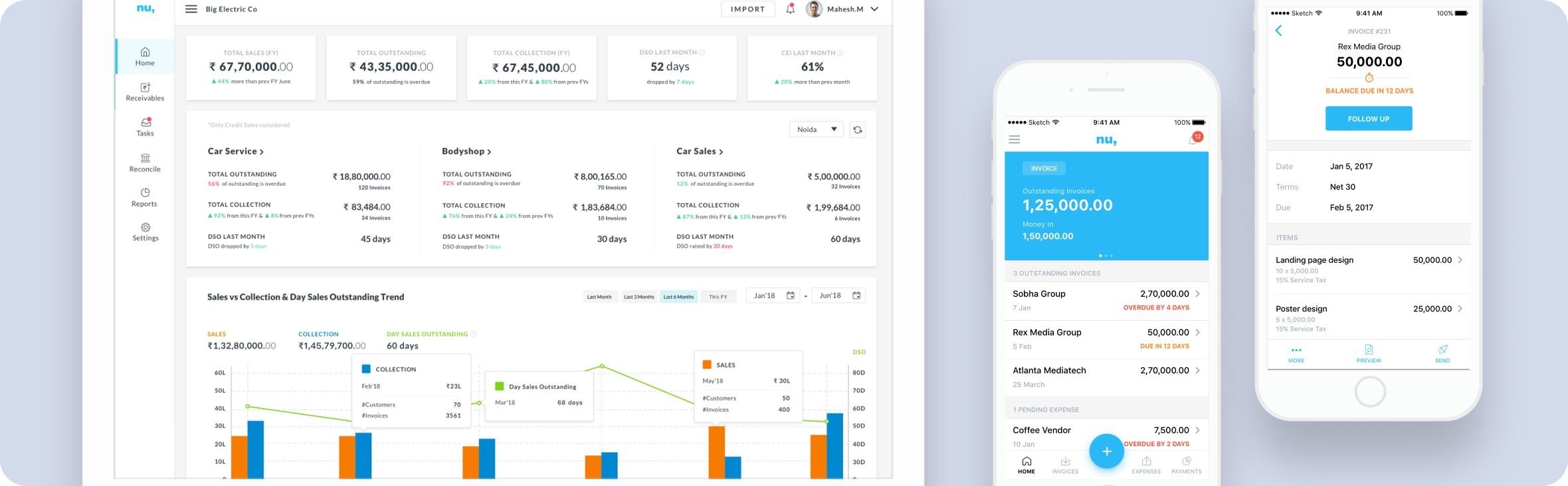
The home screen offers a quick, actionable overview of key financial data, split into two sections:
Top carousel:
• Outstanding invoices & incoming payments.
• Pending expenses & outgoing money.
• Net gain/loss to show bank balance health.
Invoice view is set as default, based on customer feedback prioritizing collection visibility.
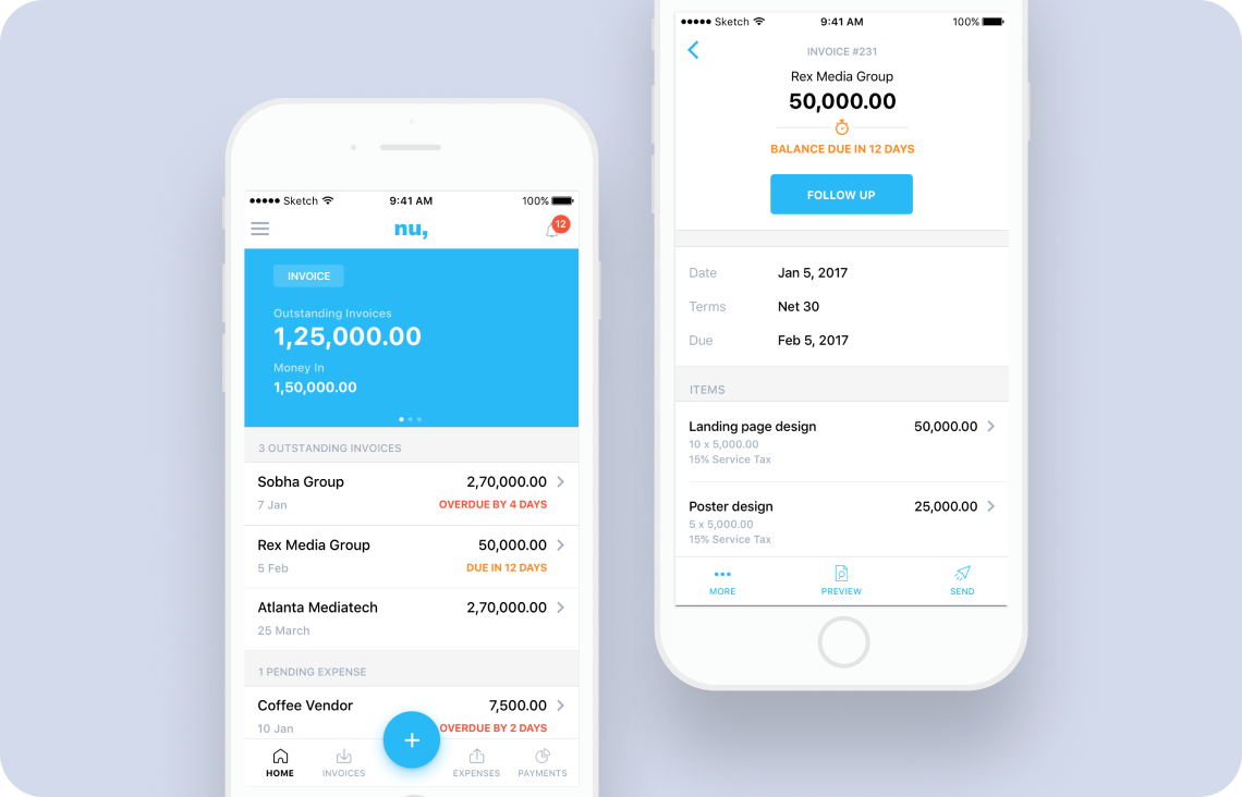
Bottom list view:
• Upcoming follow-ups on invoices and expenses that need attention.
The flow designed to help merchant create, send & track invoices, estimates & expenses was kept linear so that they can predict what will happen next. This minimizes the effort required by a user to achieve their goal.
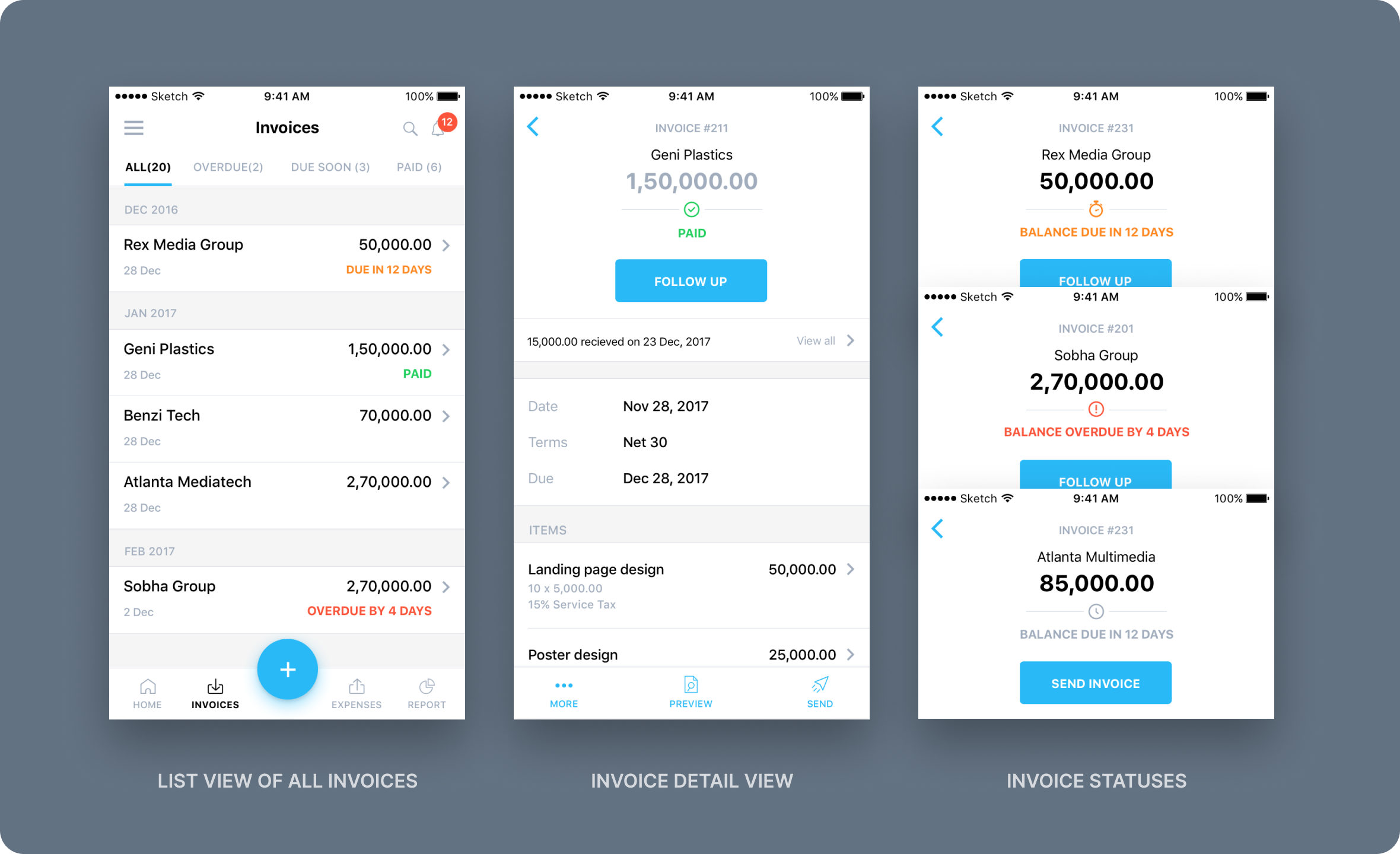
Form, scale and layout of information honours the data be it in the list view (all invoice page) or card views (Invoice detail page). Idea was to create a layout that felt bespoke, with big numbers and generous spacing but didn’t sacrifice modularity.
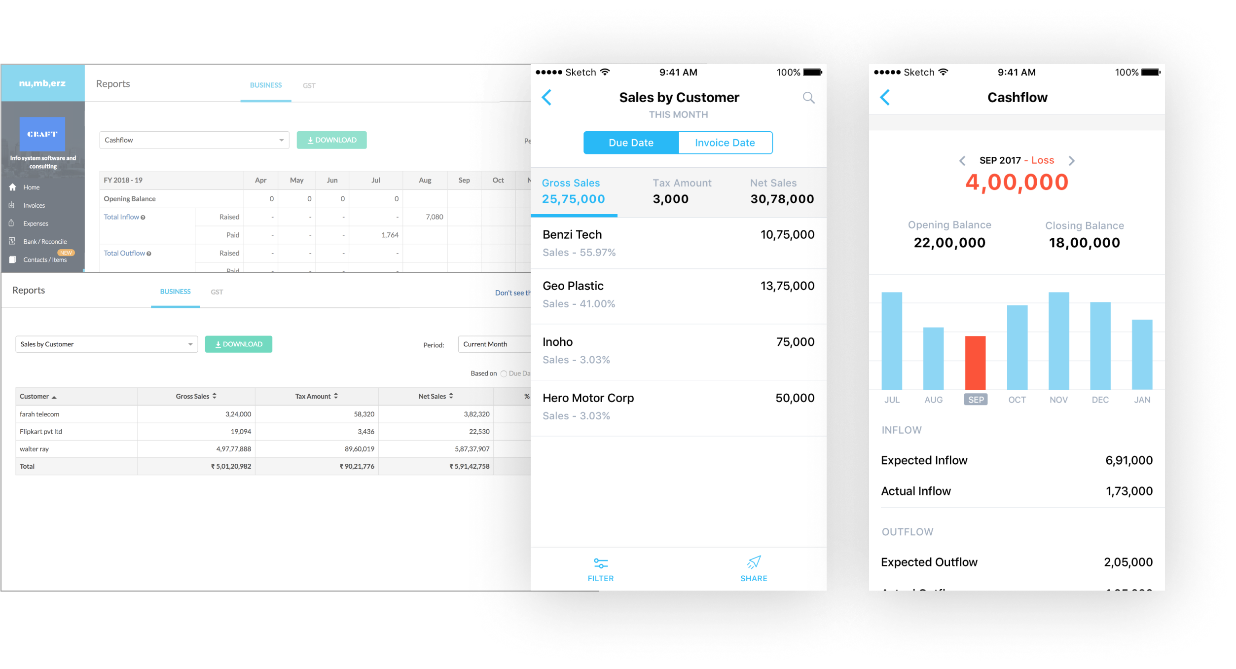
Redesigned key reports for mobile to balance KPI clarity with detailed data. Translated dense web tables into clean, scrollable lists with ample spacing and tap-friendly bar graphs for better readability and interaction.
Account receivables is designed to make collecting money fast & easy. It was initially built to help mid-size businesses get a one shot-view of their outstanding amounts and help them follow up for payments. We validated the p.o.c with presale customers using the design prototypes.
After getting traction in the mid-size business segment, we upgraded it to full-fledged CRM for collections to fulfil the needs of large businesses with dedicated finance & collection teams struggling with tedious excels in managing their collections.
Target customers
The target customers varried from accountants & sales team (who double up as collection agents) in mid-size busineses (20-100cr) to finance & sales teams in large busineses (100cr & above).
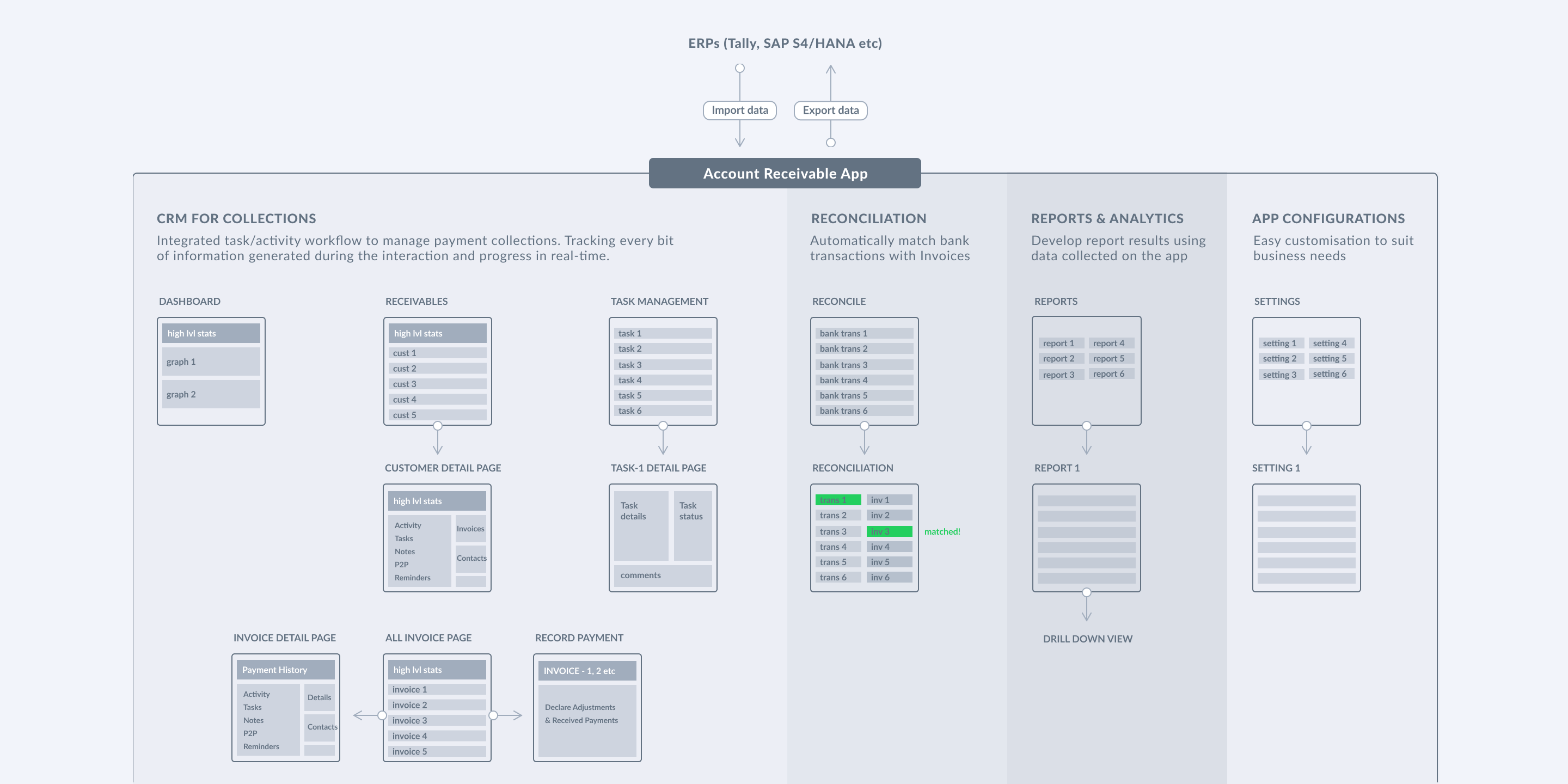
APP STRUCTURE
Problem: One of the big challenges in small, medium or large business is ensuring their customers pay on time so that their business cashflow remains healthy. Customers many times take 15-50 days to pay over the assigned credit period and this puts business cashflow at risk. The existing ERP solutions don't cover workflows around payment collections like keeping a track of business & customer interaction on payments/disputes. Hence, reducing the scope of tracking data that reflects customer’s behavior dynamically, and on a real-time basis.
Solution: We designed CRM for payment collection with integrated task & activity workflows to manage collection at customer & invoice level, tracking every bit of information generated during the interaction and progress in real-time. The solution helps the collection team follow up on prioritized tasks, track expected payments, promise-to-pay & solve payment disputes. It also offers insights on the collection team’s performance and better visibility of high & low-risk customers. Designing for better visibility of information that will aid in timely collection & the workflows around it was the challenge we had.
CUSTOMER JOURNEY: Receivables page > Customer Profile > Customer Invoices > Invoice Detail page
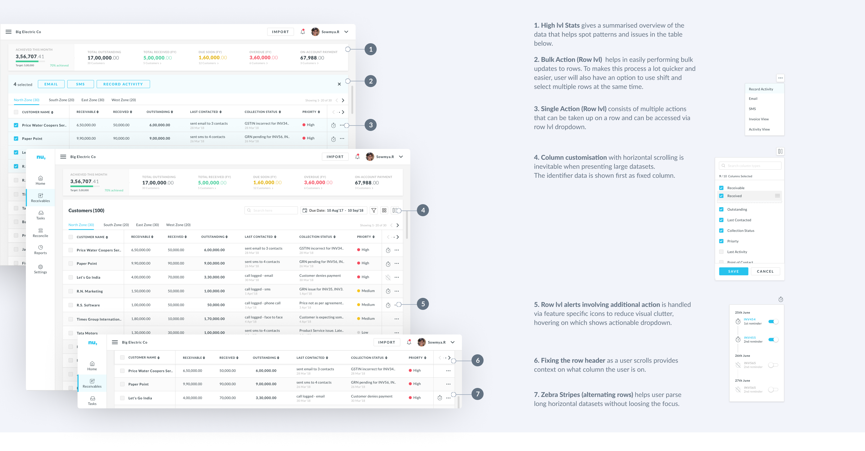
Designing an enterprise application means one has to deal with tons of data and grids and tables. Efficient data tables allow users to scan, analyze, compare, filter, sort, and manipulate information to derive insights and take informed actions. Some of the fundamental principles that guided the table design process:
1. Ability to scan lots of data at once, i.e., show various status & data types like numerals & text.
2. Help user take informed actions by easy comparison of data in columns & rows.
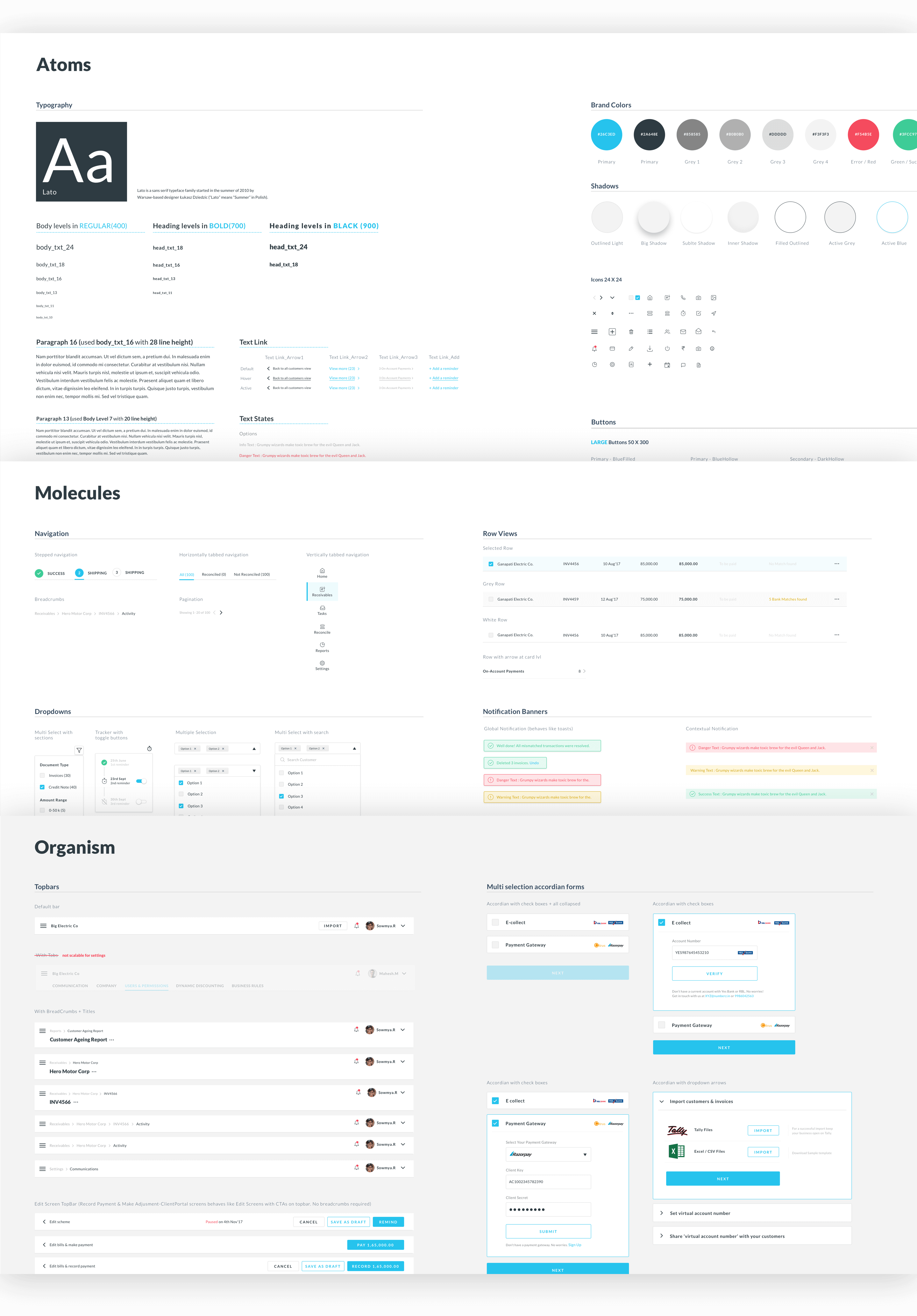
An early investment in designing a basic UI style guide in parallel with product helped significantly in building proof of concepts fast be it at a feature level or a whole new product being conceptualized from grounds up. I didn't have to re-invent the wheel to think about fundamentals like color, use of icons, typography, buttons, etc. This also helped me achieve an almost consistent design language in my workflows, across all products.
As our product scaled, and so did our design team. More no. of UI components were designed, old components like filters, date pickers, tables, etc were improved upon to solve more business use cases. By the time I had one more designer contributing to designing component and another consuming it, hence the need to make our guidelines more mature & accessible so that it's easier to use and clearer to discern both for designers & developers with various backgrounds.
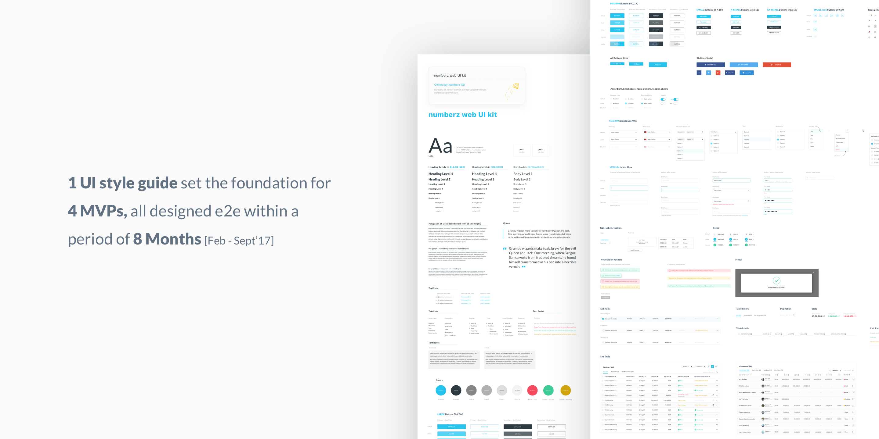
Redesigned the basic UI style guide using Brad Frost’s Atomic Design framework. Components were restructured into atoms, molecules, organisms, and templates, making it easier to build complex UIs using reusable fundamentals. This also helped identify and clean up inconsistencies across composite components