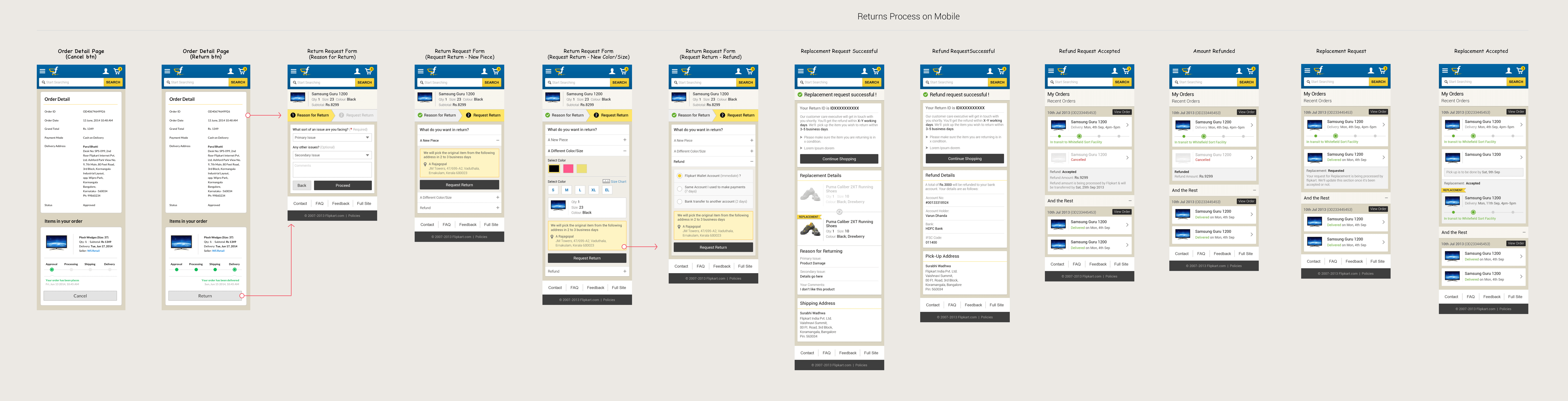
At Flipkart, I was part of the team focussed on building post-purchase e-commerce customer experience. We designed & shipped order management to help customers Track, Return/Replace & Cancel order themselves on consumer app. We were the first Indian e-commerce startup to launch the self serve order management for consumer early in 2014.
Role: Interaction Designer - level II
Duration: 2013-15
Role: Interaction Designer - level II
Duration: 2013-15
Business goal (PHASE-1)
Reduce post-purchase customer calls to enquire on ‘how to return, refund & cancel order’.
Customer goal
Empower customers to manage their orders themselves i.e. inititiate return & cancel both on mobile & web.
Success metrics
- % reduction in customer service calls for post-purchase concerns.
- % increase in online order management activities across platform: no of order returns/replacements/exchange & cancel.
Contributors: 1 Interaction Designer
Contributors: 1 Interaction Designer
High level customer journey
- PRE-PURCHASE
- Browsing & comparing products
- Reading reviews
- Exploring new products
- Looking for deals & offers
- DURING PURCHASE
- Understanding the product
- Comparing products
- Shortlising products
- Decision making
- Payment & Checkout
- POST-PURCHASE
- Tracking order details
- Order Management (return & cancel)
- Contacting customer support
- Help
- PRE-PURCHASE
- Browsing & omparing products
- Reading reviews
- Exploring new products
- Looking for deals & offers
- DURING PURCHASE
- Understanding the product
- Comparing products
- Shortlising products
- Decision making
- Payment & Checkout
- POST-PURCHASE
- Tracking order details
- Order Management (return & cancel)
- Contacting customer support
- Help
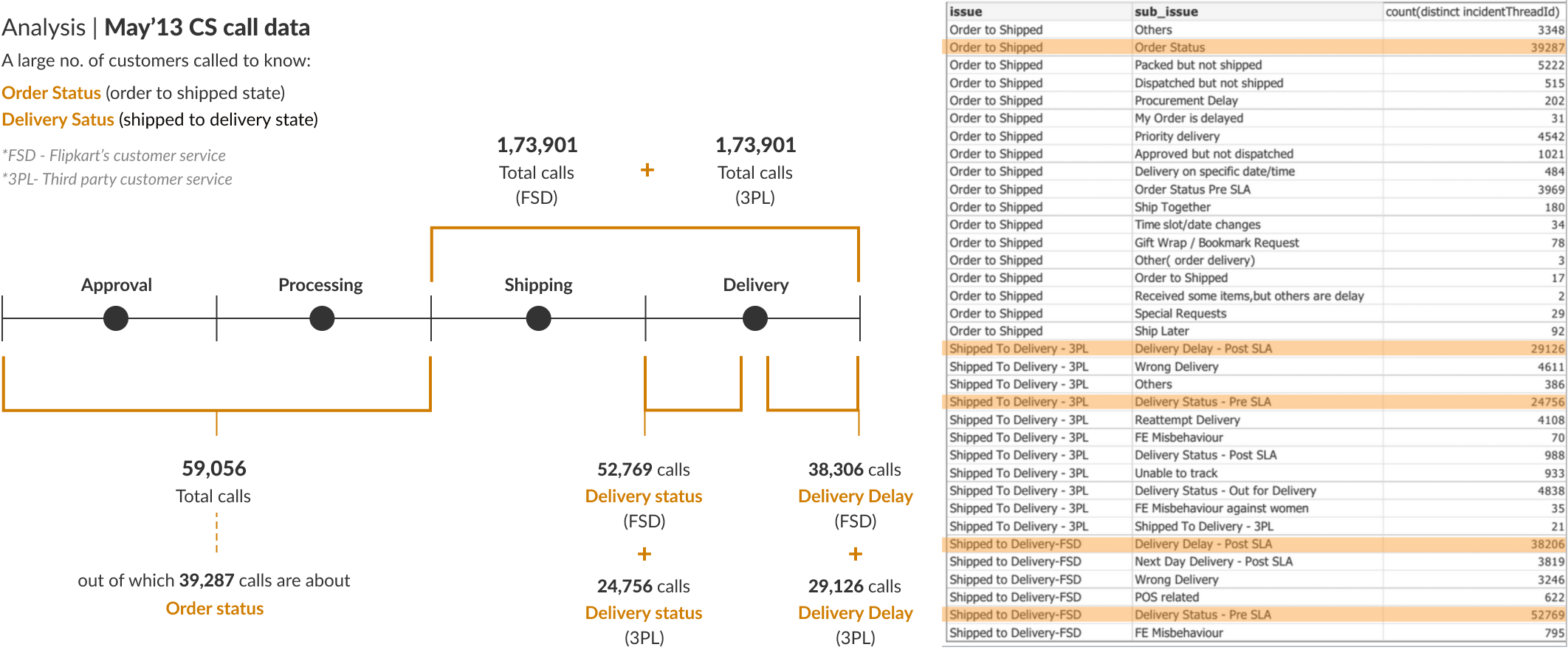
While we shipped the ability to Track, Return and Cancel orders online, the flipkart customers still continued to call customer support (CS) for help with these actions. As per CS call data the maximum calls were on:
Track Order CS calls: ’Whats going on with my order?’
Return Order CS calls: ’How do i return this order?’
Delivered Order Issue CS calls - ’Who can help me solve my order related problem?’
Track Order CS calls -
’Whats going on with my order?’
Return Order CS calls -
’How do i return this order?’
Delivered Order Issue CS calls -
’Who can help me solve my order related problem?’
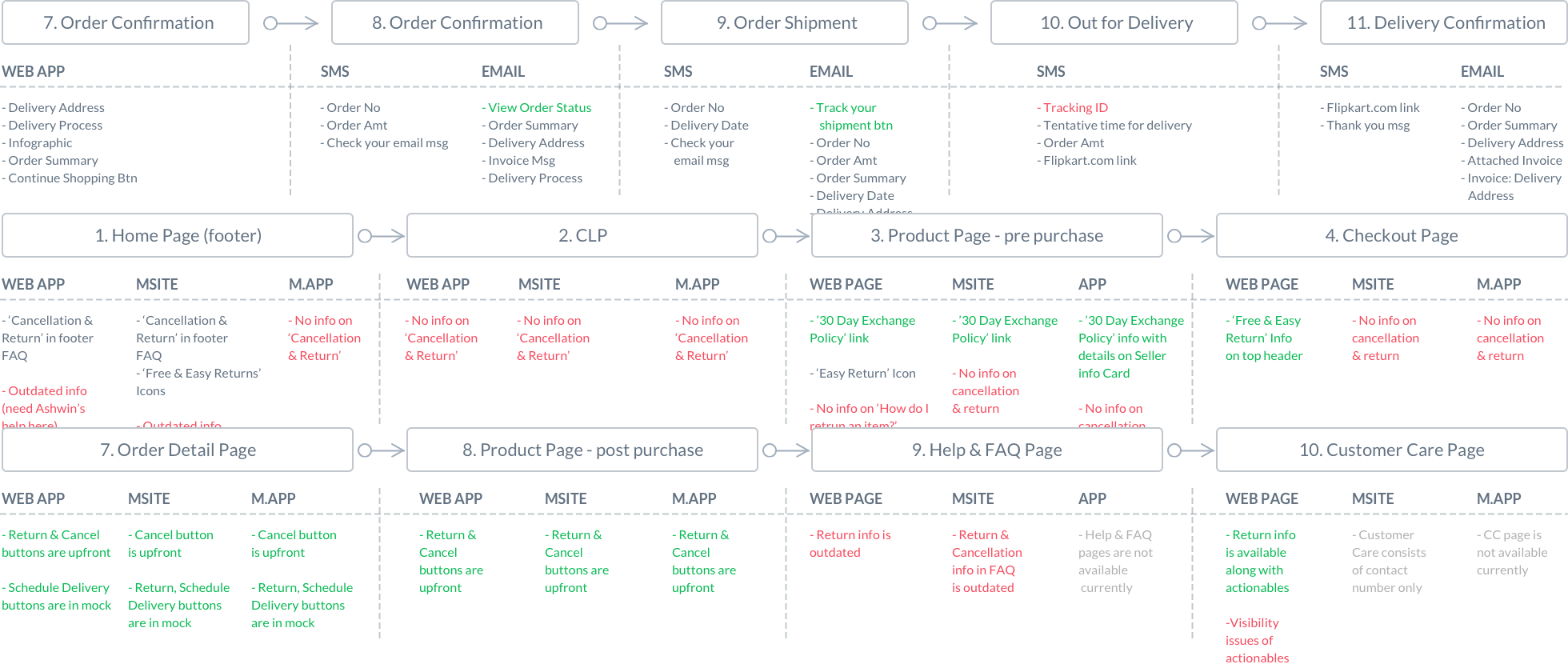
Built a user journey map to identify touchpoints in web, msite & mobile app to improve discoverability of post-purchase features.
Improve discoverability and drive adoption of post-purchase, self-service features.
Reduce customer calls by x%
In most of the design solutions shown below, my approach was to retain the core functionality and make targeted UI improvements to enhance discoverability. The goal was to guide users through better visual cues and onboarding, helping them quickly understand and adopt key features.
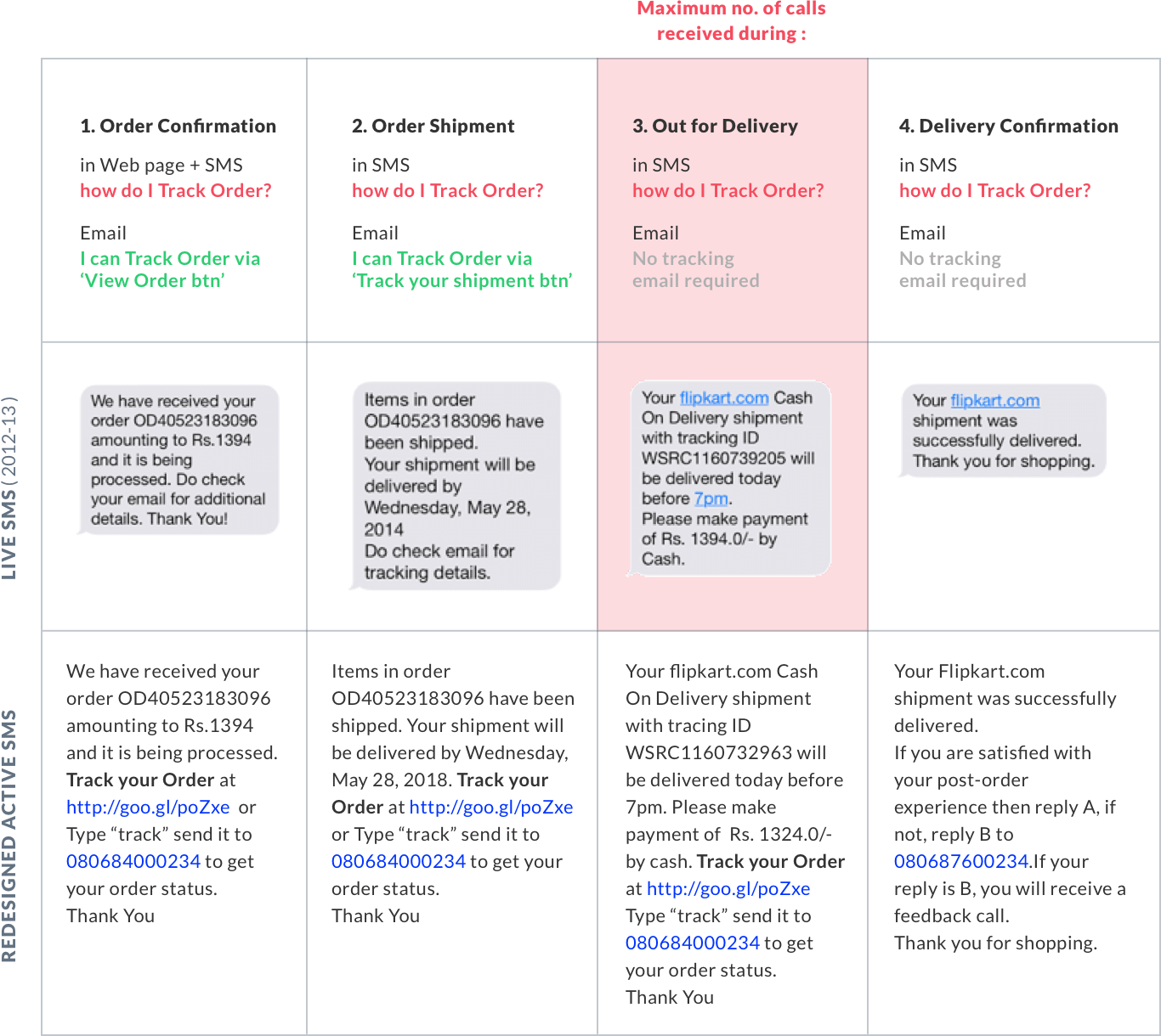
We switched to rich-text sms to help customers track their order via:
get order status sms - for without internet mobile users
url link in sms - direct to msite track order page for internet enabled mobile users.
Also, used sms to collect feedback on post purchase experience to improve the service.
Business goal (PHASE-1)
- In the first month of launch, the average click through rate (CTR) of Track Order URLs in SMS performed better in metro cities which has more mobile internet users.
- Overall, the CTR was on 19% for URL in SMS, compared to just 4.2% for Emails.
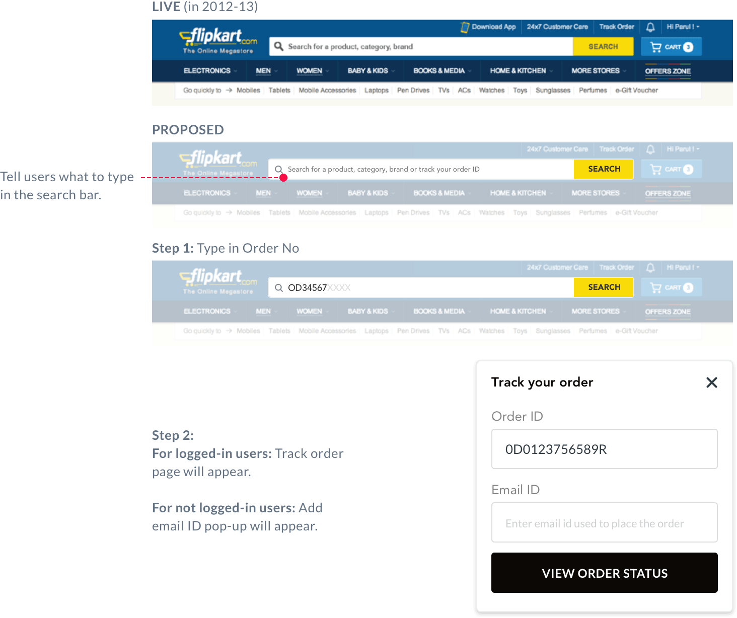
During user testing, we tasked users to look for their Track Order related info on web & mobile app. We observed many of them ended up scanning homepage up & down, and very small % of them went to My Account in the top bar to discover their order related info.
Clearly, homepage was looked as a touchpoint where users could find everything they need easily and quickly. This led me to propose the Track Order (not-logged in users) and Order Status (logged-in users) widget in the zones of the highest visibility to catch user’s attention.
This proposal wasn’t considered as the identified zones were the most revenue generating touchpoints, reserved only for Offers & Deals showcase.
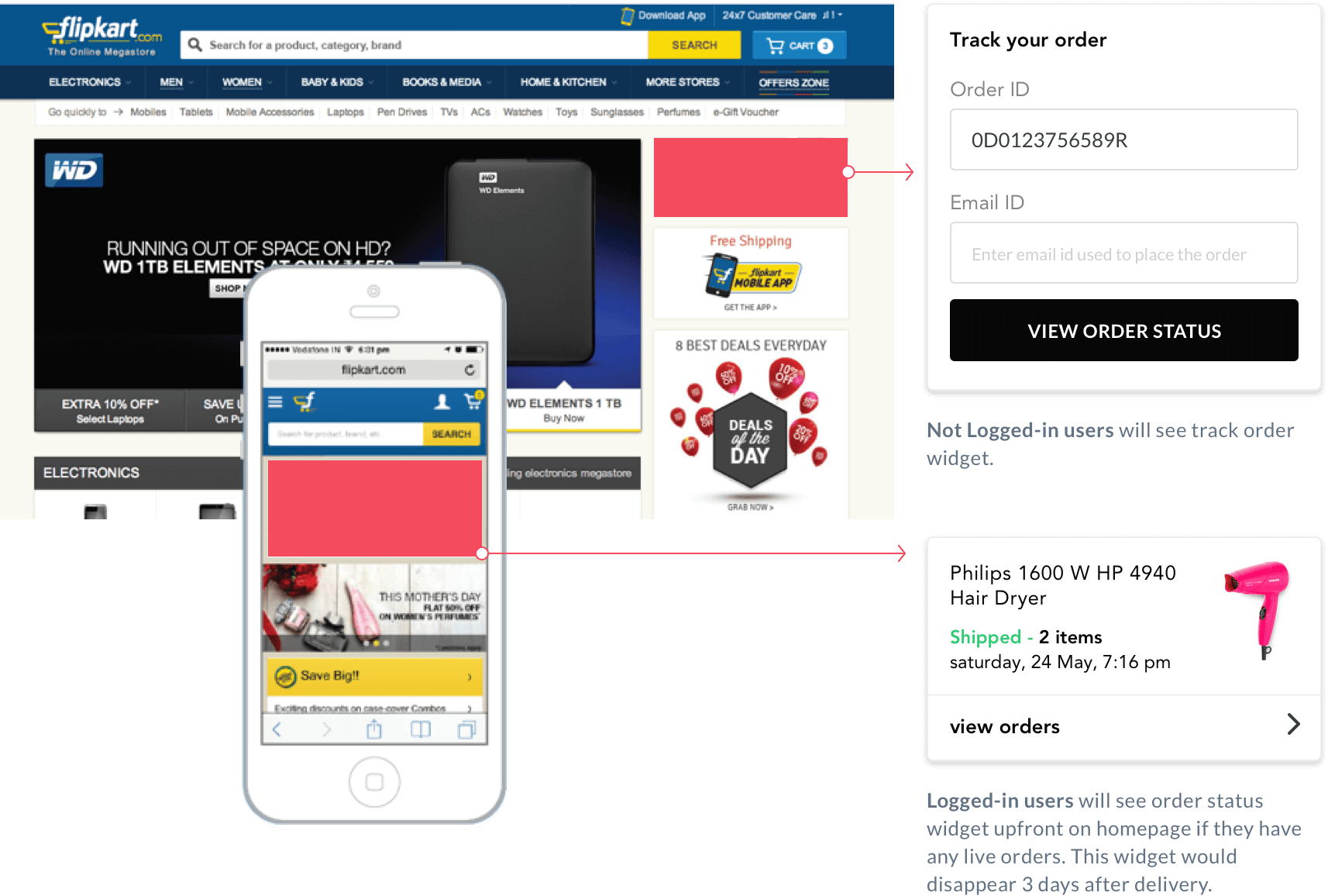
As per data Flipkart’s prominent search bar served as the fastest route to discovery for users on home page. Hence, I proposed on leveraging this touchpoint to enable user to track their order.
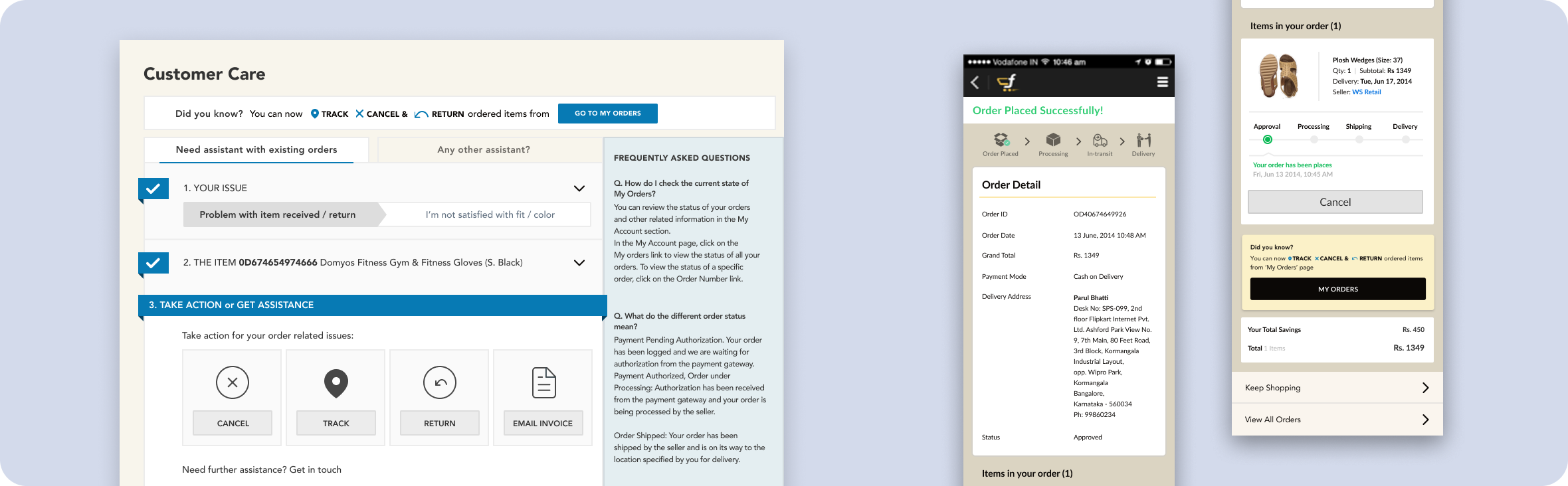
Problem
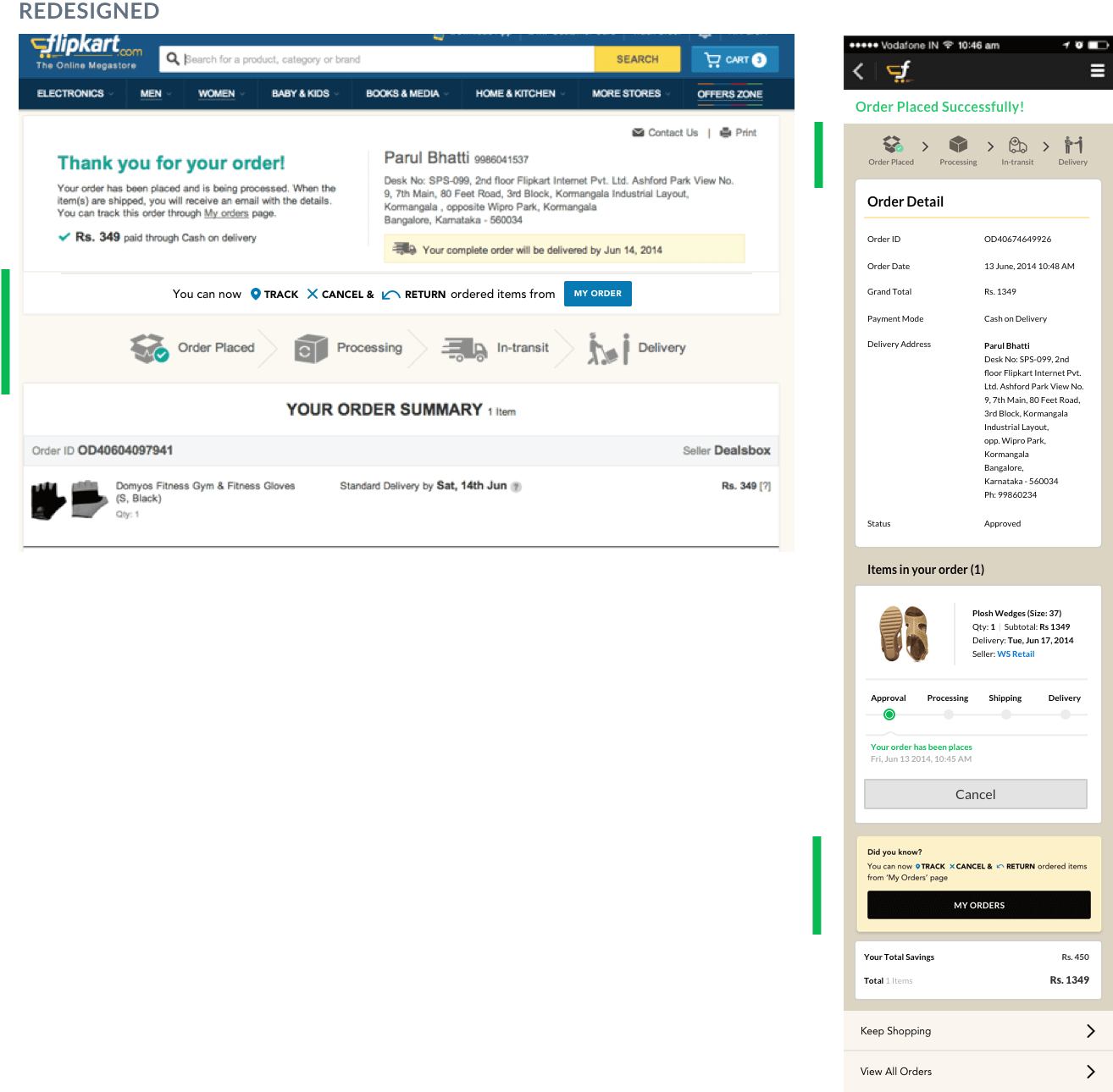
On interviewing and talking to several customers we concluded that after placing their order they didn’t know it can be tracked, cancelled or returned from My Order page. Many of them were also anxious about the next steps on their order delivery.
On web confirmation page customers were certainly missing the Track Order message & link to My Order page and same for mobile.
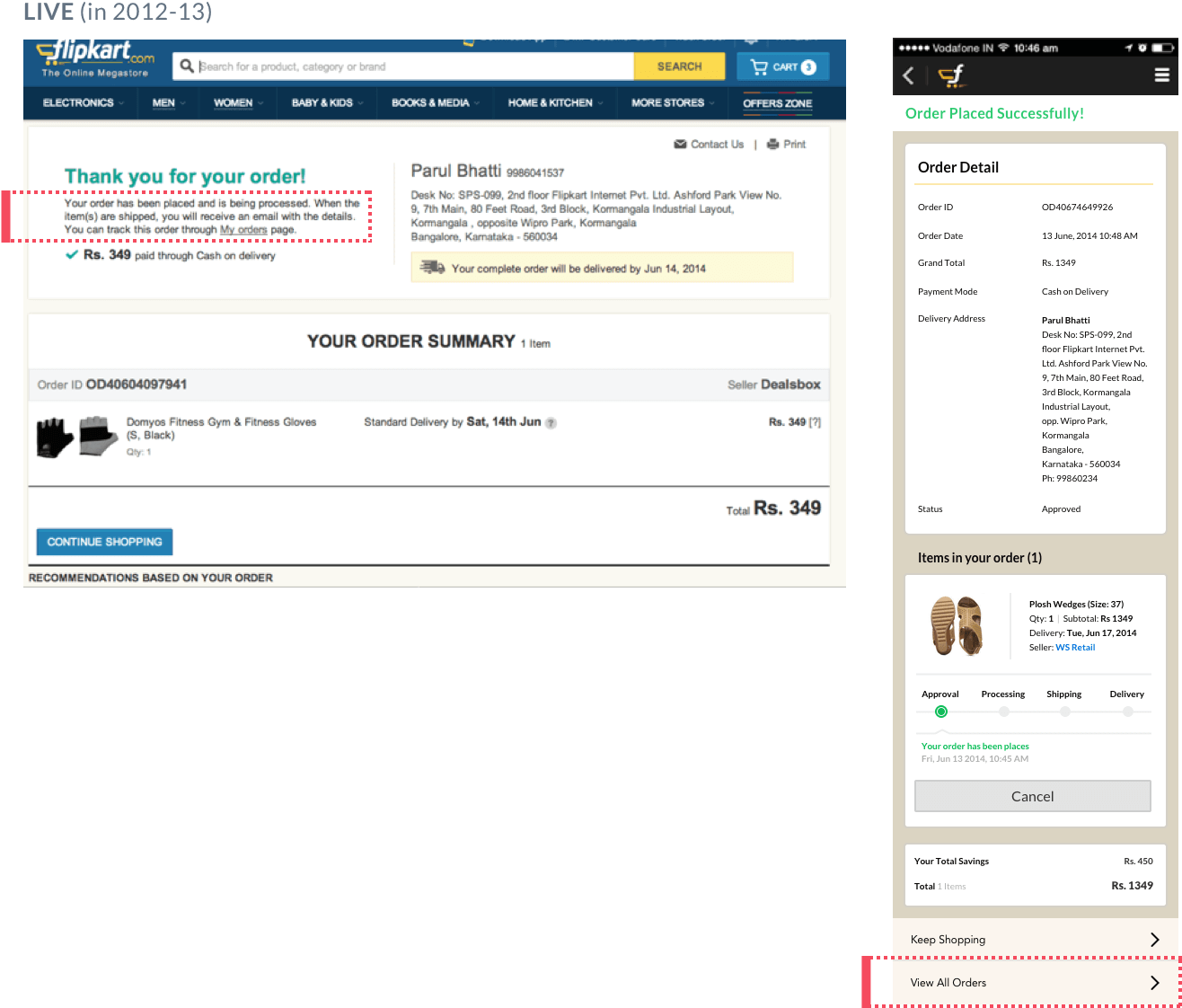
Solution
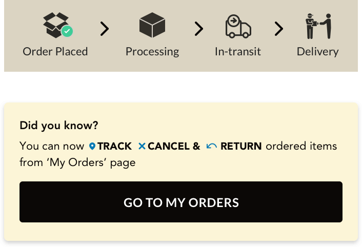
We introduced infograph on order deilvery process and placed it upfront. As per our findings from user testing the hierachy of this communication on web & mobile worked effectively in communicating the process.
We also introduced ‘Track, Cancel & Return’ message strip & card with big, clear CTA to guide user to My Order page.
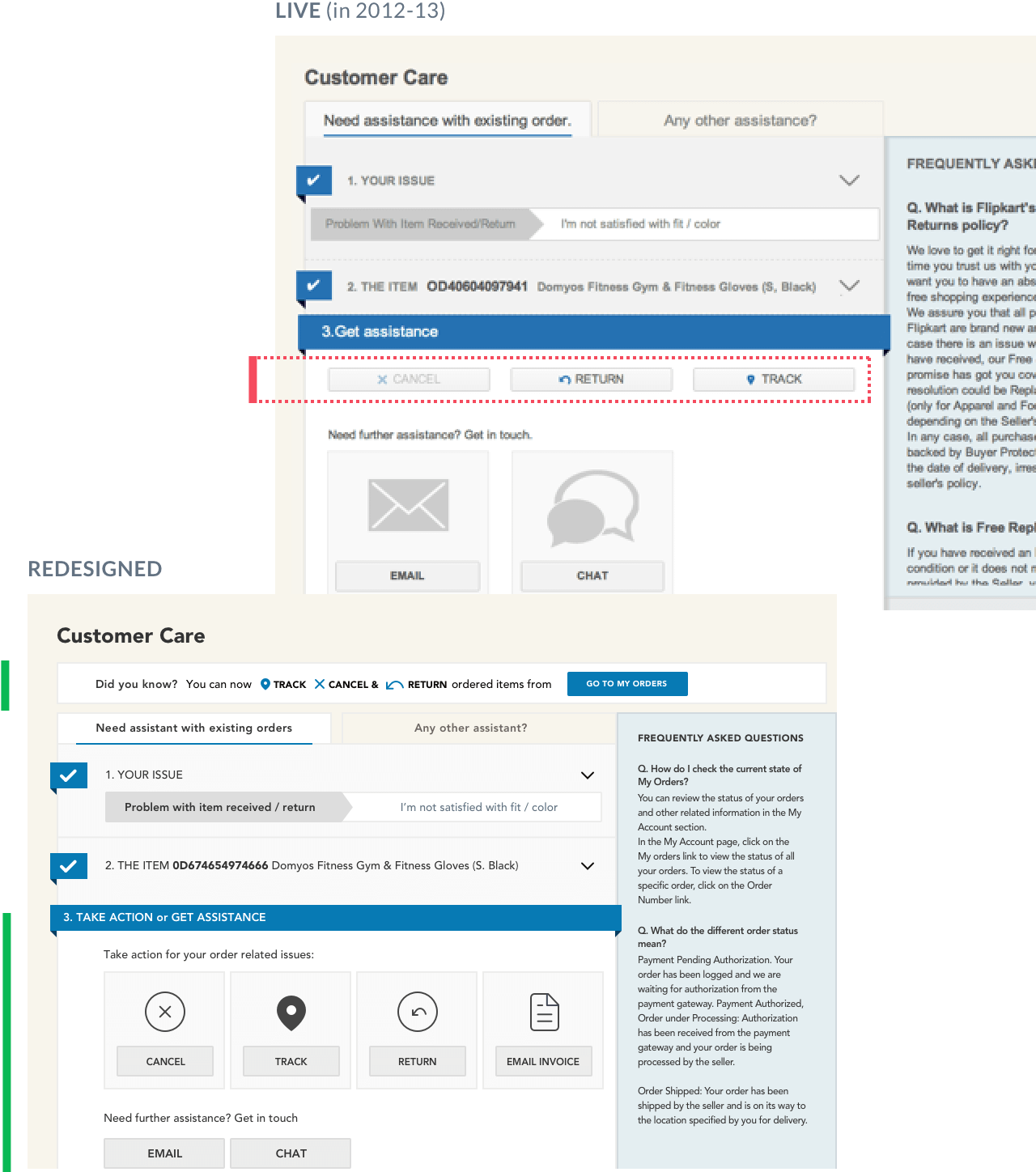
Problem
As per data, users were ignoring self-serve actions for Track, Cancel & Return related issues and were instead going to email & chat to report the following:
’How do I cancel my order?’
’How do I get Invoice for my order?’
’How do I return?’
On investigating further we realized many didn’t notice these buttons placed in proximity to large Email & Chat clickable cards and few didn’t understand the purpose of these buttons.
Solution
We prioritized self-serve actions by incorporating them in a clickable card with big icons so that they are hard to miss.
The micro-copy was re-worked to following:
- A changed section heading ‘Get assistance’ to ‘Take Action or Get Assistance’ to communicate the ’self-serve’ purpose
- Introduced title text above self-serve CTAs to address user’s concerns.